CSS-Progress-Circle
CSS Progress Circle
Visit the Web Page
Animation or Fixed, Dark or Light, Flexible Customization
Use
Live Demo
CSS
<link href="localpath/circle-progress.css" rel="stylesheet">
SCSS
@import "localpath/circle-progress.scss";
Font Optional
<link href="https://fonts.googleapis.com/css?family=Poppins:400,700&display=swap&subset=latin-ext" rel="stylesheet">
HTML
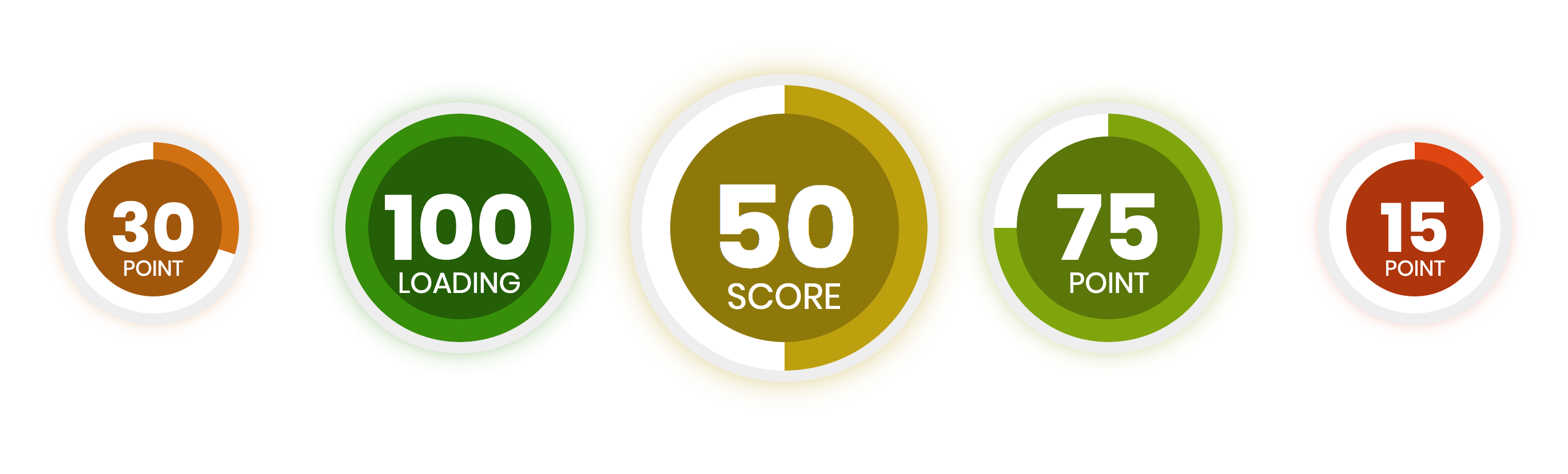
<div data-value="30"><div data-progress-type="POINT"></div></div>
Default
<div data-value="0" style="
        --circle-size:100px;
        --inline-circle-size:80%;
        --border-width:5px;
        --border-color:#eee;
        --font: 'Poppins', sans-serif;
        --bg-color: #fff;
"><div data-progress-type="POINT"></div>
</div>
Options
| Option | Value |
|---|---|
| data-value | 0 to 100 number:value |
| data-progress-type | string |
| –circle-size | number:value:pixel |
| –inline-circle-size | number:value:percent |
| –border-width | number:value:pixel |
| –border-color | color:hex |
| –font | font-family:optional |
| –bg-color | color:hex |